HYDRA EMR
How Department Architecture and Role-Based Context Aware Workflows Enhance Specialty HealthCare.
How Hydra EMR Was...
When Hydra first launched, the goal was simple: take the admin chaos out of healthcare and empower medical teams to focus on what they do best—caring for patients. ut as our user base grew, so did the diversity of practitioners relying on Hydra. A system built for generalists was suddenly being asked to serve surgeons, dentists, OB/GYNs, lab techs, and everyone in between. The cracks started showing when workflows overlapped and providers (users) routinely encountered screens, forms, and data fields that simply didn’t apply to their daily practice. It’s like giving every chef in the kitchen the same knife and hoping for a Michelin star.
Understanding The Problem
Unlike other digital products, healthcare software isn’t
“one size fits all” it’s “as many sizes as there are
departments.” Forcing every department to use the same set
of tools led to frustration, wasted time, and, honestly, a
few too many “Can I hide this?” support tickets.
Doctors wanted their core tools, nothing more, nothing less.
As a designer, I realized true productivity, clarity, and
error reduction would only come from creating an environment
that adapted to the way individual clinicians actually work.
Our users? A mix of surgeons, nurses, dentists,
cardiologists, operations leads. Every department with their
quirks, needs, and “don’t-show-me-that” peeves.
Hydra started out focused and nimble. But growth brought new
specialties, more complex workflows, and feedback that said:
- "Love it, but... can I hide this?"
- "Why do I see dental fields in my OB notes?"
- "There's so much stuff I never use..."
- "Can this feature be more streamlined for our use..."
The Concept
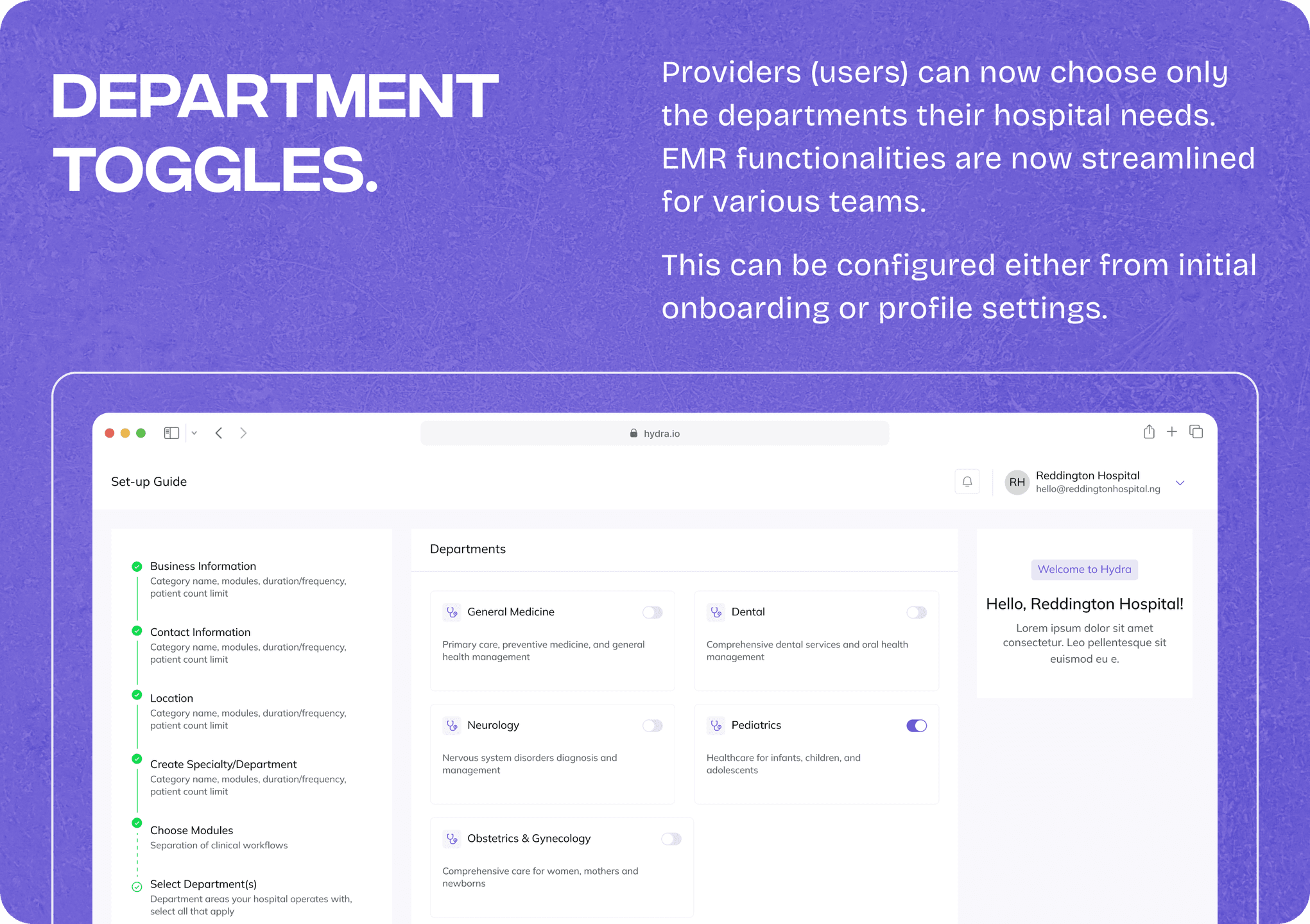
Modular Departments + Context Is King.
Our first major solution was to restructure Hydra using a
modular design paradigm. Instead of building fixed,
hard-coded workflows, we broke the EMR into plug-and-play
components, each corresponding to a specific department.
This meant we could tailor patient interactions, chart
views, and clinical forms to suit the needs of cardiology,
dentistry, pediatrics, and more—all within a unified
platform.
Now, onboarding a new specialty doesn’t mean repainting the
house, just snapping in (or out) the right modules.
Defining Core Journeys and Key Flows
- Cardiology lives its best life with its own charts.
- Dental gets fresh workflows, minus the extra noise.
- General practitioners stay lightning-fast with just what they need.
- The tools you want. The charts and views you like. The way it works for you. Nothing irrelevant.
And what if, when you log in, the software feels like it’s yours?

Research and Discovery
User Research
- Methodology: Conducted in-depth interviews and contextual inquiries with clinicians across a range of specialties—surgeons, nurses, dentists, OB/GYNs, cardiologists, and operations leads. The aim was to capture both their workflow, pain points and departmental nuances.
- Shadowing & Feedback: Shadowed users during real patient encounters and daily admin work with our EMR, uncovering and noting moments of friction and unnecessary complexity.
- Quantitative Analysis: Surveyed support tickets and usage metrics to identify frequent requests, such as “Can I hide this?” or complaints about irrelevant forms cluttering their interface.
Competitive and Internal Analysis
- Market Scan: Benchmarked leading EMRs and role-based workflow platforms, noting how modularity and adaptive UI principles were (or weren’t) implemented elsewhere.
- Internal Workshops: Organized ideation sessions with product, dev, and selected clinical training personnels to synthesize research findings and align on high-impact problem areas.
Design Process
Defining Core Journeys and Key Flows
- Mapped user journeys for each department and role from patient triage and appointment scheduling to lab orders and documentation.
- Simplified onboarding for new specialties, ensuring that adding a department didn’t disrupt the broader platform.
Testing and Iteration
-
Iterated sketches and relatively mid-fidelity version and ran focused usability testing sessions with representatives from various specialties. Gathered qualitative feedback on clarity, relevance, and ease of navigation.
- Leveraged feedback to design final UI versions, surfacing or hiding features for certain departments to minimize noise and error.
- Documented the new modular approach in an internal design system, streamlining handoff to development and ensuring future scalability for emerging specialties.
Design System and Handoff

The Rebuild: Hydra EMR, Modularity & Context
We pressed pause on “more features” and asked the tough questions:
- Can we plug-and-play departments, so adding new specialties isn’t a nightmare?
Turns out, yes.
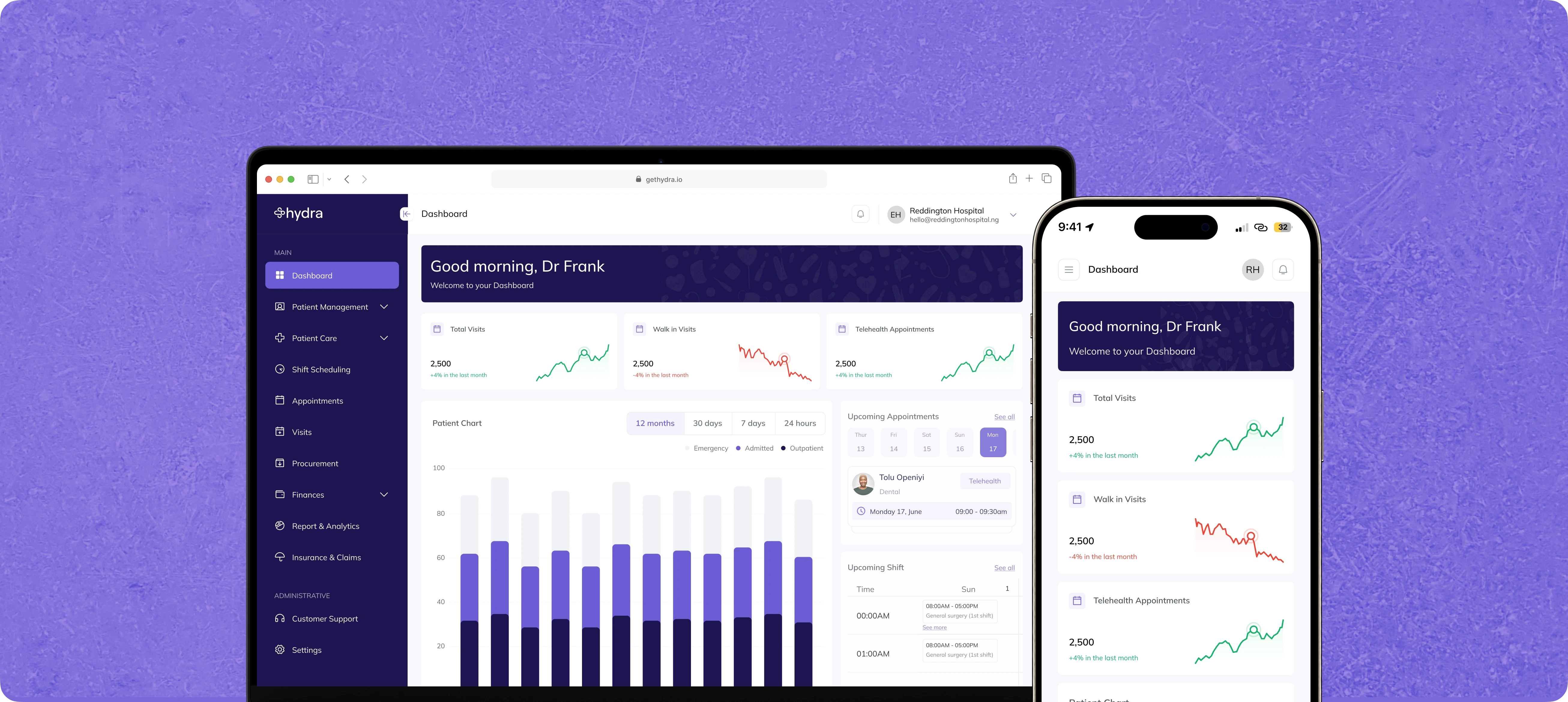
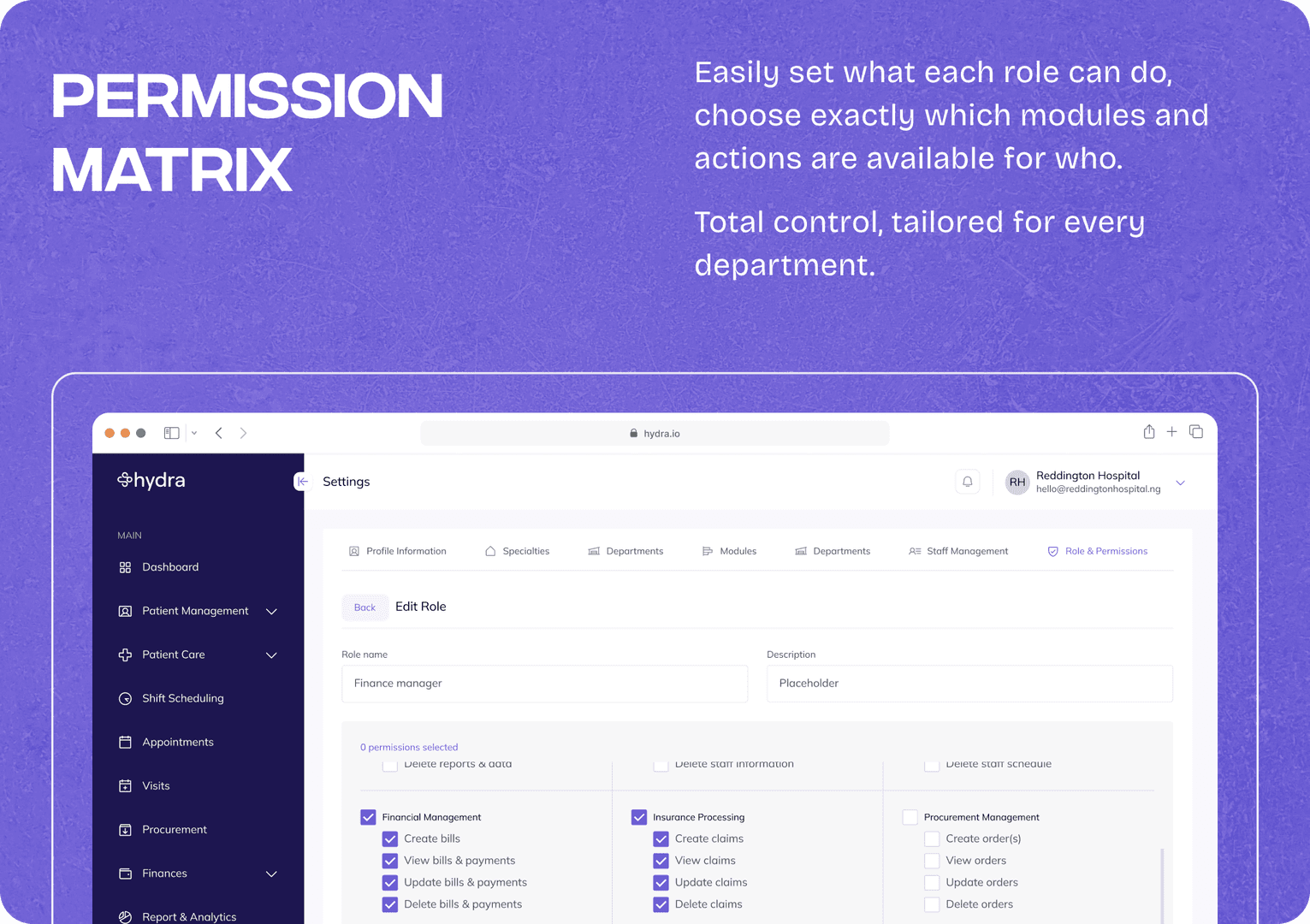
Alongside modularity, we built a smart context engine that takes into account the user’s role and department every time they log in. We created a way to enhance surfacing relevant features, clinical tools, and patient data, precisely when and where each team member needs them.
For example, a dental nurse’s dashboard is streamlined for appointment management, documentation relevant to oral health, and nothing else. Meanwhile, an OB/GYN sees only maternal health flows and tools.
This adaptive interface doesn’t just declutter the user experience; it actively reduces click fatigue, lessens cognitive load, and allows clinicians to work at pace with greater confidence.
Modular Architecture
Departments became components, not hardcoded tabs. Now, spinning up a new specialty takes minutes, not contacting us. Each gets:
- Unique patient flows
- Tailored charting templates
- Only the tools they really use
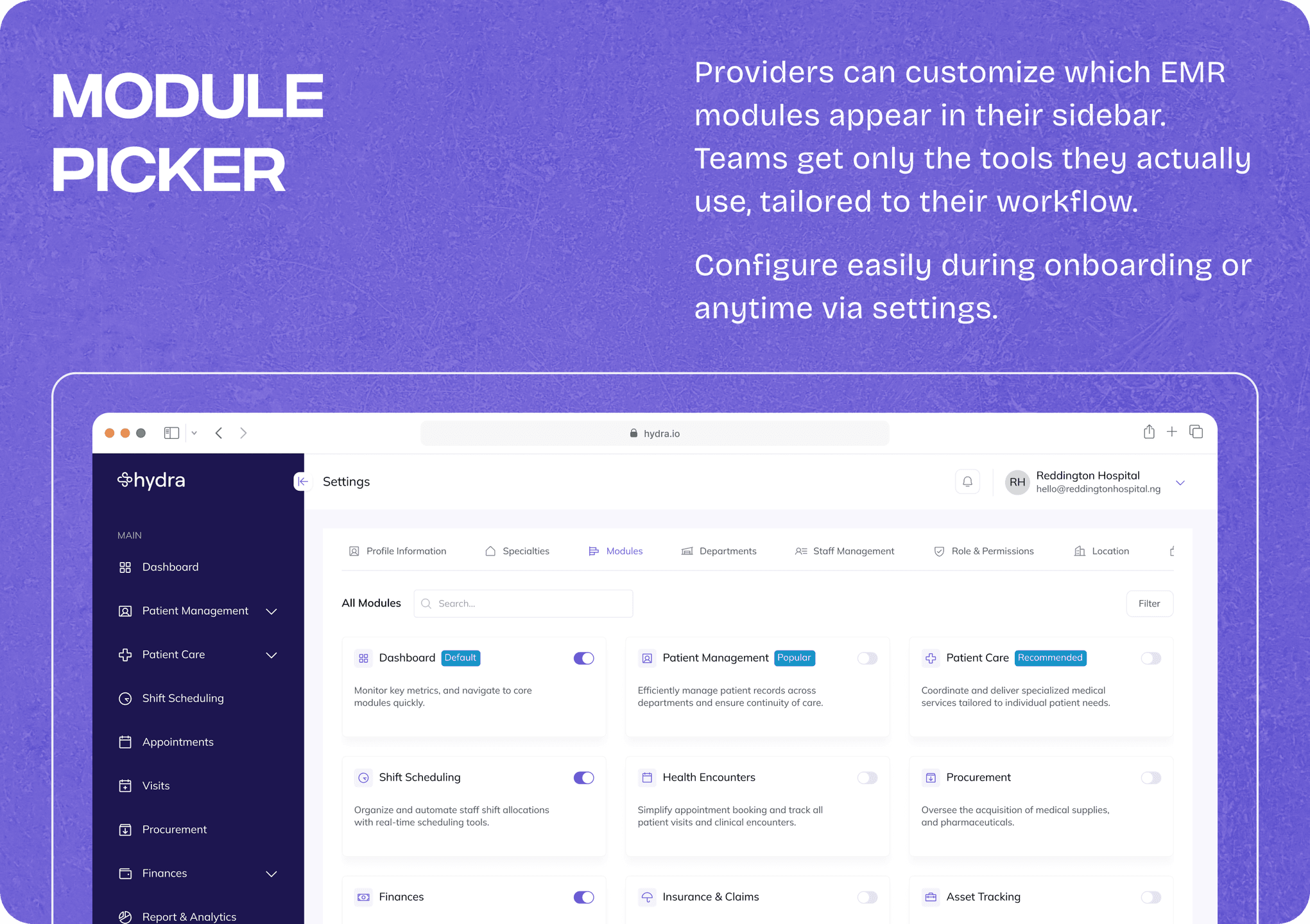
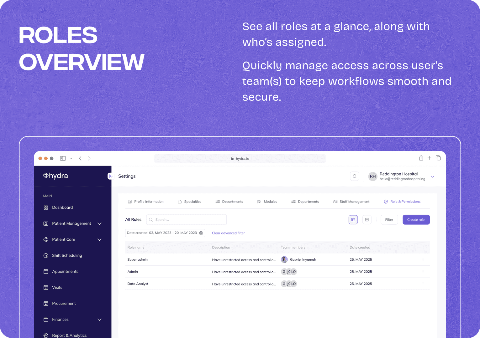
Contextual, Role-Based UI
Log in as a triage nurse? You see exactly what you need, right from the jump.
As a consultant? Your world, your way.
All powered by a context engine that serves up the right features, automagically.
The Results: Clarity (and a Little Confetti)
Since the roll out of the new functionalities to our clinical users, they now saw only what was relevant, making training faster and adoption rates measurably higher across new departments.
Happier clinicians. “Finally, no clutter!”
- Cleaner codebase, faster launches.
- Higher adoption in new specialties.
- AND the dev team isn’t blustering over every new request.
We’re already seeing less “how do I hide this?” in support. Instead:
- "Can you add this one thing to Dental? We love how specific it is now…”
Conclusion & Lessons
By pivoting toward modular, context-aware design, Hydra became significantly easier to scale and maintain, both for our internal teams and our clinical users. Support queries dropped, clinicians reported faster navigation with fewer errors, and our product team could roll out specialty enhancements more confidently, knowing we weren’t breaking someone else’s workflow elsewhere. My key notes are;
- Kill feature creep with modularity: Sometimes reduce, don’t just add.
- Talk to users—then listen harder: Have chats with actual users, Record meetings (consensual), The rants are gold.
- Custom feels good. Even in healthcare: Figure the best flow(s), then design for “a-ha!” moments.
If you’re thinking of making your product less like a buffet and more like a chef’s knife kit, let’s talk! Or, you want to build your product from scratch with a product minded foundation, my inbox is always open.
— ‘Sewa. 💜